
Image: Times New Roman Liberation Serif comparison

Size of this preview: 638 × 600 pixels. Other resolutions: 255 × 240 pixels | 11,514 × 10,821 pixels.
Original image (11,514 × 10,821 pixels, file size: 3.86 MB, MIME type: image/png)
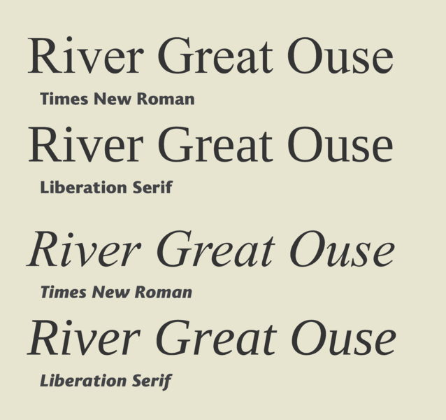
Description: Times New Roman and Liberation Serif have to be very similar in structure: designer Steve Matteson was tasked with creating a lookalike design that would exactly match its widths. However, he changed the design considerably, making it less rounded and more square.
Title: Times New Roman Liberation Serif comparison
Credit: Own work
Author: Blythwood
Usage Terms: Creative Commons Attribution-Share Alike 4.0
License: CC BY-SA 4.0
License Link: https://creativecommons.org/licenses/by-sa/4.0
Attribution Required?: Yes
Image usage
The following page links to this image:

All content from Kiddle encyclopedia articles (including the article images and facts) can be freely used under Attribution-ShareAlike license, unless stated otherwise.