
Image: Total CO2 emissions by country in 2017 vs per capita emissions (top 40 countries)

Size of this PNG preview of this SVG file: 450 × 600 pixels. Other resolution: 180 × 240 pixels.
Original image (SVG file, nominally 810 × 1,080 pixels, file size: 99 KB)
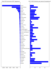
Description: The graphed data shows total CO2 emissions in 2017 by country/region, for the top 40 emitters. The right plot shows the same data but per capita. The EDGAR 2018 report (http://edgar.jrc.ec.europa.eu/overview.php?v=booklet2018) updated world carbon emissions for different countries. This data plotted in python using Matplotlib updates existing graphs in Wikimedia that were made using the 2014 report.
Author: Mgcontr
Usage Terms: Creative Commons Attribution-Share Alike 3.0
License: CC-BY-SA-3.0
License Link: http://creativecommons.org/licenses/by-sa/3.0/
Attribution Required?: Yes
Image usage
The following page links to this image:

All content from Kiddle encyclopedia articles (including the article images and facts) can be freely used under Attribution-ShareAlike license, unless stated otherwise.
.svg)